Quantcast
Channel: Interior Design Singapore ID.com.sg
Viewing all 411 articles
Browse latest View live

8 Awesome Children’s Bedroom Design That Makes Me Want to Be a Kid Again

$
0
0
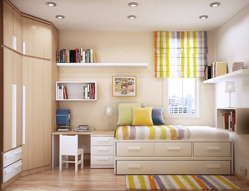
When designing a children’s bedroom, whether we have a toddler or school-going children at home, we want a design that is effortlessly fun, functional and also practical for the years to come. Children grow up too fast; we certainly don’t want to renovate their rooms over and over again.

As a parent, I always believe that providing our children with a wonderful living space in which they can thrive, learn and play is very important. I also believe that a child’s home can have a huge impact on how they grow and develop, so we should always try to make their living spaces as comfortable and as fun as possible without breaking the bank.

With the upcoming TOP of our new home, our criteria for our son’s bedroom design will be: 1) a timeless design that will last into his teenage years, 2) have enough storage space for the many different odds and ends that will accumulate over the years, 3) simple yet stylish with easy to maintain surfaces, 4) innovative workstation that encourages learning, and 5) painted in his favourite colour combinations, of course.

Therefore, we’ve been searching for children’s bedroom design ideas, and here are some awesome designs that we really like. We like to share them with you too!

1.
image
Credit: Rezt & Relax Interior

2.
image
Credit: InzzStudio Interior Design

3.
image
Credit: Urban Design House Pte Ltd

4.
image
Credit: Streetstrut Home Design Decoration Trend

5.
image
Credit: Home Designing

6.
image
Credit: Idees-Interior Design

7.
image
Credit: NID Design Studio

8.
image
Credit: InzzStudio Interior Design

These awesome children’s bedroom designs make me want to be a kid all over again! What about you? :)

Greys And Monochromes At Miltonia Residences

$
0
0
image
A monochromatic interior can always be enriched with texture and details. In this case, the designer plays a lot with glass texture. The end result is a sophisticated, elegant home with a unique factor.

In the living and dining area, the designer sticks to glass texture for displaying decorations in shelves.

And in the living area, glass texture is not the only one, as evident by the timber used for the TV feature wall cabinet and a wall that separates the living area from the entry hall.

We mentioned that the designer goes for a sophisticated interior, and sophistication almost always goes hand in hand with luxury. In the dining room, for example, the focus is on luxurious materials, and elements that look royal and prestigious.

A round table is an interesting choice, since it has little space for serving food, but functionality is not a focus point in this interior.

In the bedrooms, we finally see the glass texture rise to its full glory. That is especially true for the second bedroom, which is actually separated from the other parts of the apartment with glass panels.

image
image
image
image

19 Things You Need to Know Before You Start Your Renovation

$
0
0
image
Source: Absolook Interior Design

Renovating your home can be very exciting. It’s all about new possibilities and the promise of coming home to a comfortable and great-looking space after a long day at work. Before you start however, here are some things you need to take note of.

1. Charge for additional electrical power point
There is a charge for every additional electrical power point
While convenient, do note that additional electrical power would cost between $60 and $70. In addition, each installation for new lighting point is between $30 and $40. All these will add up to your overall renovation costs.

2. Cost for air-con wiring and re-wiring
The cost for wiring an air-con has been included in the price of your air-conditioning system. If you think that the service comes free, think again.

3. Ask for a detailed renovation quotation
image
Source: Interior Doctor

Renovation quotations do not include detailed specifics of materials, such as tiles and finishes used, so if possible, ask your contractor to measure your unit and state every work to be done in the quotation as clear as possible.

4. Clearing of debris and haulage costs
Take note that the standard cost for clearing debris and haulage is set at the price of $215 plus GST. Be wary of contractors who ask for more than that amount to clear debris or haulage because the cost is actually paid to them directly from HDB.

5. Renovation permit
While there is no need to pay for renovation permits anymore, it is still mandatory for HDB renovations to apply for a permit for certain works through the HDB website. Also note that for renovation of HDB units, you have to engage a contractor that has registered under the HDB Registered Renovation Contractors’ Scheme.

6. Cost of chemical wash
Chemical wash or acid wash is usually done at the end of renovation works to give you home a final polish before you move in. The cost for this is between $95 and $100.

7. Check water holes for cement or sand
This is especially important because some contractors may throw cement or sand into the pipe during renovation, which may lead to leakage in the future.

8. Cost of gas piping
If you opt for gas piping instead of cylinder gas, you will have to get your contractor to liaise with City Gas to connect gas piping to your cooker hood. The $70 incurred is for the trip. The billing of the gas piping on the other hand will be billed to you directly by PUB.

9. Painting
The cost for painting is between $1,100 and $1,500 for a unit, and should comprise of five colours.

10. Installation of bathroom fixtures and electrical point
image
Source: Image Creative

Some contractors may quote for the installation of bathroom fixtures and electrical points separately. If possible discuss with the contractor to install these items free of charge during renovation works.

11. Hacking of walls
When bringing down walls, make sure your contractor include touching up of tiles in his quotation. This area usually includes the area that is left exposed by the wall that has been hacked off.

12. Take note of add on prices
This is especially important when asking for quotation from contractors for kitchen cabinets because the base price quoted usually refers to basic materials. So when asking for quotation be sure to ask for every detail, such as the size and material to be used.

13. Installation of ceiling fans
This will cost around $25 to $30.

14. Water heater installation.
This will incur additional costs too, at around $60 per unit.

15. Materials used
Depending on whether you install treated or non-treated wood for cabinets, the price may vary.

16. Inclusion of accessories
Try to get your contractor or interior designer to include electrical switches, doorknobs and handles in the package price or quotation because these small things can add up. To save some money, you can source for your own accessories so that you won’t be charged inflated prices for them.

17. The disadvantage of open-concept walk-in wardrobes
image
Source: Homevista

These can be a nightmare to maintain because moisture from the bathroom can lead to mouldy interiors and items. To solve this, position your open-concept walk-in wardrobes away from moisture rich places.

18. Ditch the kitchen sliding door
image
Source: Weiken

To save cost, forego the sliding door separating the kitchen and living area because it does not make much of an impact in keeping odours out. What’s more, you can actually utilise the open-concept plan to add storage spaces or counters.

19. Choose a reliable interior designer
To assess whether your interior designer is reliable, do some background check before you engage them. Usually, the best ones are based on customer's video reviews. You should also check out the designer's recent completed projects where you can examine the carpentary workmanship.

Victorian Style - Concept Art

$
0
0
Note: The following images are concept art for a Victorian style design and not from an actual project

The entryway
image
Guests are greeted by an intricately designed partition that separates the entry way from the dining and kitchen.

The living room
image
We added plush tufted couches to maximize the Victorian flair in this living room, but at the same time draped a post-modern style rug under the coffee table to keep things at present-day.

The master bedroom
image
A bedroom fit for a King and Queen! Underneath a chanderlier, this room echoes a sense of luxury with its tufted headboard and bedframe and intricate Victorian detailing on the walls and furniture.

Master bedroom TV shelf and console
image
Enough said, we'll let the intricacies and detailing speak for themselves.


HDB BTO 4-Room Modern Contemporary At Blk 505C Yishun Acacia Breeze

$
0
0
image
In modern and contemporary interiors, black and white colors are usually the standard. But sometimes, even cream and shades of it can work ideally.

But let’s start from what makes this environment unique, and that is not the cream color. In the living room, the TV feature wall is truly special.

The designer has installed glass background behind the TV feature wall, which reflects the opposite side and makes it look unconventional.

Moving up to the kitchen, it is all about the carpentry finishing of the elements. In recent years, more natural timber design of the finishing is becoming more popular, as it creates a sense of playfulness in the room, even though only one color is used.

In the bedroom, natural wood again makes an entrance through nightstands, providing the room with the much needed natural feel. The room is also rich with vintage and retro elements, which are great contrast to the modern outlook.

image
image
image
image

HDB 4-Room Modern Mosaics At Bishan

$
0
0
image
Mosaics play a huge role in the interior décor of the apartment. Every room features its own mosaic type piece. For starters, in the living room, the TV feature wall is a mosaic in its own way.

Enriched with tiles, pictures and glass, the TV feature wall can be described as an art piece.

The dining area and the living area are separated with faux mosaic walls. Faux walls are a great way to separate two rooms, but still get the visual impression of a spacious and big space.

An interesting element of the kitchen is the one that is supposed to be a built in shelve for decorations. It is a nice touch, as it adds style and fashion to the modern kitchen. The black metallic finishing of the kitchen elements adds the element of drama.

The master bedroom is decorated in modern style, but with a touch of Japanese influence as well. The sliding doors are characteristic for Japanese style, and we see here how they can work in modern setting as well.

image
image
image
image
image
image
image
image
image
image
image

A Touch of Class and Elegance in Neutral Ambient

$
0
0
image
Whenever a designer opts for neutral colours in a modern interior design, he/she needs something to add style, character and make the environment stylish.

In this case, we have two approaches that the designer uses for this goal. The first one luscious texture, added through drapes, carpentry and wall texture to every room.

In the living room, we have luxurious and luscious drapes, while the bedroom is enriched with marble and quarts on the walls.

The second approach is by adding baroque and Victorian style decorations and elements in the room. In the living room, the designer places two such elements, the chandelier on the ceiling, but also the round baroque mirror above the TV on the feature wall.

We can also notice influence of other styles in the interior design. Such is the case with the coffee table in the living area, a clear sign of Japanese influence, where the table is positioned as low as possible.

The bedroom features a walk in wardrobe, a popular choice in Asian interior design in recent years.

image
image
image
image

HDB Modern Simplicity Design At Jurong West

$
0
0
image
In the modern urban jungle, people could always use a little simplicity that will make the environment calming, comfortable, yet modern in the same time.

In this case, the designer goes for urban simplicity, sticking to clear and straight lines for the finishing of the outlook. Yet in the same time, there are some urban elements that show it is an apartment in an urban city.

In the living room, there is a little Japanese and Asian style influence, with a low coffee table and a Japanese plant next to the sofa. Additionally, the designer has also placed two low wooden chairs to mimic Japanese environment.

And while the chairs are not much functional, they are visually appealing.

The bathroom is the best example of simplicity into an urban jungle. The urban element is clearly visible with the mosaic tiles in the bathroom, but everything else is as simple as possible.

The bedroom is another room where the concept of “as simple as possible” is applied. The bedroom is actually open for entrance from the dining room, which is an interesting and unconventional layout of the apartment.

image
image
image
image

Gold Embroidery Texture for Luxury and Prestige

$
0
0
image
Gold is the colour designers use when they want to emphasize the luxury and the prestigious feeling of an apartment.

In this case, there is a little extra. The one thing that makes this apartment so unique and truly special is the wallpaper texture, with gold embroidery on it. Embroidery plays a huge role as a decoration in the apartment, visible in almost every room of the apartment.

The designer also is not afraid of mixing different motives of embroidery, even in the same room. For example, in the bedroom, the designer uses one type of embroidery for the wall, and another for the drapes.

In the entry hall, the designer displays in a glass framed picture what looks like ancient Chinese sculptures. From that moment on, you are greeted with pure luxury and wealth.

The end result of mixing the texture, embroidery and the gold color is an environment displaying elegance, affluence, extravagance, sophistication, luxury and prestige.

image
image
image
image
image
image

Clean Modern Scandinavian Design At Foresque Residences

$
0
0
image
Using different shades of white the designer has achieved what is the main goal here, to make everything look as pure and as simple as possible.

With different shades, the designer creates layering effect of the room, but in the same time, keeps the environment clean and bright.

The designer employs floating storage cabinet units for both the shoe cabinet and the TV cabinet. This floating effect helps achieving airy feel of the room. In the same time, by using simple design and lines, the designer stays true to the simplicity as his main goal.

The shoe cabinet has the same design as the TV cabinet, with a small difference. In the shoe cabinet, the designer installs display niche, for sculptures, decorations or anything interesting.

The TV cabinet is also floating, but it doesn’t touch the ceiling as well. This “flying” effect, combined with the sky like ceiling, creates the illusion and the impression of a bigger space, since it adds depth to the condo unit.

Last, but not least, the designer had to introduce some dash of colour and zest to the room. In all white design, the designers opts for green ottoman in the center of the living area.

image
image
image

image

Modern Black and White At Casa Merah

$
0
0
image
Every black and white combination needs something unique, and in this case, that is mirrors. But before we get to the mirror additions and subtle integration into the design, let’s take a look at the living area.

In the living area, we see a little bit unconventional design of the TV feature wall. There is no cabinet, just floating shelves, and the TV is floating as well. But what is interesting is the décor of the TV feature wall.

The dining area and the bedroom are the room where the designer adds mirrors as main theme. Mirrors are a huge aspect of modern design, and we see them here in full display and glory.

In the bedroom, mirrors are integrated in a more subtle way, with a glass/mirror door of the wardrobe. In the dining room, on the other hand, there is nothing subtle.

On the contrary, we see the full glory of a mirror wall. Following the black and white theme, the designer has framed the mirror with black frames to add dramatic feeling.

image
image
image
image
image
image
image

HDB 4-Room BTO At Blk 548B Segar Palmview

$
0
0
image
Whenever you want to mix modern style with other interior design styles, a single object can make all the difference in the world.

In this case, what is essentially a modern design, is matched and mixed with other styles thanks to a different ceiling light. For example, in the living room, the designer adds a touch of industrial style.

In the master bedroom we get vintage and retro ceiling light and lamp, while in the other bedrooms the designer places contemporary and artistic ceiling lights.

Sticking to clean straight lines, the designer follows simplicity and minimalism as guiding lines in the decoration of the apartment. In every room, the designer tries to add just something subtle to break the simplicity.

In the living room, that element is the heart shaped coffee table, in the master bedroom we get galactic picture (and the space as theme follows through other rooms as well).

The best job the designer has done is in the kitchen, where the timber top of the kitchen island is matched perfectly with the light color cabinets.

image
image
image
image
image

HDB BTO Scandinavian At Blk 666B Punggol Waterway Woodcress

$
0
0
image
When you think of Scandinavian and modern design, you often think of white and cream colors and their shades. But whose to say that a Scandinavian design cannot benefit from colour infusion?

Such is the case here, where both the master bedroom and the standard bedroom get a splash of pinkish color.

Going back to the living room, the designer places both the TV cabinet and the regular cabinet in “floating mode”. Since the cabinets are lifted, the energy can flow through the apartment freely.

Illumination in the living room is focused on the cabinets, made out of timber, which further emphasizes the natural look of the room.

The kitchen is your regular modern kitchen, with one difference. The stove and the microwave are placed higher than usual, but that is due to practical reasons, as they are easier to reach.

In the bathroom, glass panels for the shower are the way to go. “Floating” as a theme continues here, as the bathroom cabinet is also in floating position.

image
image
image
image
image

Modern Contemporary Arc At Tampines

$
0
0
image
Right from the moment you enter the apartment, you get the feeling that you are in a classic modern contemporary environment. And that is partly true.

There are two ways you can make an apartment flawless. One is to integrate some unique elements, and the other is to execute everything to perfection, every line, every angle, everything. The latter is the case here.

Simply put, the finishing touches of the apartment are top notch. In essence, this is another modern contemporary interior, but the attention to details is superb.

In the living room, an interesting element is the TV feature wall, executed in a mosaic type, with white and light brown squares and partitions. But the trick is in the details, more so the lines that divide the different squares.

The dining room is unconventional, or you can say conventional, depending of your preferences. In latest years, placing a bench chair next to a dining table is a huge trend, and we see the same here.

The glass table adds a touch of luxury, but the pillars that hold are what makes it unique and as sleek as possible. As mentioned previously, it is all in the details.

The children’s rooms are done according to the gender, but they are both unique in their own way. In the girly room, for example, the shape of the floating shelves is what appeals to the eye.

In the boy’s room, on the other side, the built in display niche is an excellent idea for showing the toys.

image
image
image
image
image
image

Design Tips For Small Spaces At Hedges Park

$
0
0
image
When operating with small and tight spaces, a designer has to be creative. In this case, we see few tricks that are common in small spaces, but they are executed to perfection, and the final result is a stunning environment.

In the living area, the TV cabinet is actually a large, floor to ceiling, wall to wall cabinet. This uses all the wall space, but it also adds enough storage for all the elements.

Just next to the TV feature wall, we get a wall with floating shelves. Floating shelves help add space for decorations, but do not crowd the flooring of the apartment.

The dining room also features a large cabinet, but with display niche. The finishing of the cabinet in the dining room is made from MDF high gloss material, making it shiny and reflective.

Combined with the illumination, the cabinet makes the dining room as royal as possible.

The bedroom also features a TV, with small floating shelves above it, and built in display niches in the TV feature wall.

image
image
image

9 beautiful dining rooms designed by us

$
0
0
The Host
image
Location. Location. Location. We can't emphasize this enough. Having the dining area right outside the kitchen ensures that you not only have a shorter distance to carry that steaming pot of soup, but also ensures that you whet appetites as the fragrance wafts from the stove to your diners' noses! Way to impress your guests isn't it?


The Timeless and Evergreen
image
Here we see a classical design that transcends time. Beautiful yesterday, beautiful today, beautiful tomorrow.


The TV Junkie
image
Afraid of missing your favourite TV show? Fret not! With the dining set-up just behind the living room sofa, you can catch up on TV while chowing down at the same time.


At First Sight
image
Another location you can consider having the dining area is near the entryway to your home. Who doesn't want to be greeted by a feast waiting for them? Kick your shoes off and sit down for a sumptuous meal, but first don't forget to wash your hands!


The Warmth
image
Earth and woody tones provide a sense of warmth and rooting to nature. It's hard not to feel welcomed at this dinner table!


The Opulent
image
Perhaps modern opulence is your cup of tea? Then this design will definitely suit your tastes with its mix of style and finesse.


The Hipster Cafe
image
If casual and easy going is your style, kick back and relax with this Industrial Style cafe-like theme. Comes with your own DIY (Design It Yourself) chalkboard wall too!


The Easy Access
image
Remember what we said about having easy access to and from the kitchen?


The Instagrammer's Best Friend
image
Don't be afraid to use mirrors even in the dining area. They create the illusion of a bigger space and helps reflect light - brightening up the space and ensuring that your food photography is evenly lit for Instagram!

Creative Tips For Small Living Areas

$
0
0
image
Limited space should never be your obstacle of getting the dream living area you want. Even with limited space, you can always get the look you strive for. Here are some ideas you can consider.

The first solution is an all-white design where the living room and the dining room are combined in one. The designer uses black and white contrast for the TV feature wall to add some dramatic element in the white interior and make it look more interesting.

The second solution is an industrial style living area, where bricks on the wall serve as the contrast of the white wall. The contrast is emphasized by black fittings, and with bright yellow tables and chairs, the room looks as dramatic as possible.

In the third case, we get a classic, elegance room, with more than a sofa for chatting. The designer has placed reading corner, or more like a discussion corner. There is an abundance of lamps in the room, but they just emphasize the classic elegance.

Last, but not least, is a classic example of how mirrors can make a room look bigger and more spacious. But there is more to the room than just the mirrors.

A texture brick wall opposite the smooth TV feature wall creates contrast, and the subtle blue and yellow lines add a splash of color to the room.

image
image
image

Living Hall Modern Classic Idea You Will Love

$
0
0
image
For a modern classic concept, the color black is meant to be used a either a highlight or a feature. Take the image above as an example, our designer had incorporated a full height black colored based opened shelves behind the sofa area.

With space planning taken into consideration, open shelves are designed with the intention to make full height carpentry less bulky. This also aids conveniences to this home owner when it comes to retrival of items.

The theme "Modern Classic" had always been a never-dying trend among home owners in Singapore. We are going to present a proposal done up for a 2-bedroom condominium project to display the electic look of the Modern Classic concept.

When we mention Modern Classic, the colors of Black & White will appear in the brains of home owners. But how exactly do we use the 2 mentioned colors to present a comfortable feel of the Modern Classic Concept? Illustrations of our images will show you how Stylerider does our mix & match.

If you're a home owner with many display items which you would love to showcase, the idea of the open shelves near the dining area would be perfect, as this will open up many conversations when your guests are around.

image
A half height wall with marble tiles finishing is proposed with a classic look. Purpose of the half height wall is to ensure that sufficient lighting is evenly introduced into the unit to allow a spacious look in the flat.

With the clear glass panels sitting on the marble half height wall, this allows our customer to have good privacy while working in the study room.

Instead of sticking with a normal white colored ceiling, we'd highlighted the borders of the ceiling, acting as a frame. This idea portrays the ceiling to be the largest sized painting of the home.

The criss-crossed design is designed to be symmetrical to allow the "painting" looks neat. WIth a chandelier in the middle of this painting, perfect.

image
Open concept kitchens are designed for home owners whom are mainly not doing much heavy cooking at home. With the finishing of the cabinets coming with vertical laminate wood grains, this allows visual stretch of the cabinets looking taller rather than compressed.

Our designer had chosen to use a black tinted mirror to replace the backing in between the kitchen cabinets. With the strong reflective image presented, it reflects back how spacious the living hall of this condominium unit can be.

This idea also outcasts the usual proposals of having a tempered glass backing, with the same level of maintenance but better visual aids.

HDB Modern Resort At Blk 747 Bedok Reservoir

$
0
0
image
There are many aspects of the interior design that make this modern concept unique. But what is most interesting is how the designer manages to blend three different approaches into the living area and the dining room.

For starters, the designer introduces texture via brick like background of the TV feature wall, a trick that gives depth to the room.

Then, he adds mirrors on the opposite wall at the dining room to further emphasize the effect. Last, but not least, the designer adds vintage/retro timber dining table and desk chair in the dining room.

All three approaches are common for modern concepts, but rarely a designer uses all three of them in one apartment.

Moving onto the bedroom, we see continuity of the “triple approach”, but in smaller doses. We again get the texture (wallpaper on the bed wall), mirrors (glass doors on the wardrobe) and natural timber on the nightstand.

The difference is, in the bedroom, the finishing is a bit more subtle.

image
image
image
image
image
image
image
image
image
image
image
image
image
image
image

HDB Modern Simplicity @ Ang Mo Kio

$
0
0
image
The simple decorated apartment resembles a lot to a Western style apartment. The best example of Western influence is the bar type kitchen.

The simple decorating is also on pair with the modern and minimalistic approach to the design. And while minimalistic style is mostly associated with a black and white combination, it doesn’t always has to be the case. For example, in this case, white and grey looks ideal.

One thing that is executed perfectly is the balcony. In a way, there is a feeling the balcony is split in half, by the different material used for the floor. And since the balcony is connected with two rooms, the living and the bedroom, that might just be the case.

image
image
image
image
image
image
image
image
image
Viewing all 411 articles
Browse latest View live